A couple of weeks ago, I decided to make a No Sew Roman Shade for my office.
I saw the project in blogland , and immediately decided to try it. Like…that night.
I used what supplies I already had and made this…
You can read about that project HERE.
I had intended to paint my office first, before making a shade, but I was just too impatient.
I liked the shade, (sort of), but not with my yellow walls.
So I finally painted the walls my favorite color, Khaki Shade by Sherwin Williams.
I forgot to take a picture of the roman shade with my new paint color, but let’s just say, I wasn’t diggin’ it.
The cream-colored shade just didn’t go with the Khaki Shade paint like I hoped it would.
So I got rid of the shade and decided to start over.
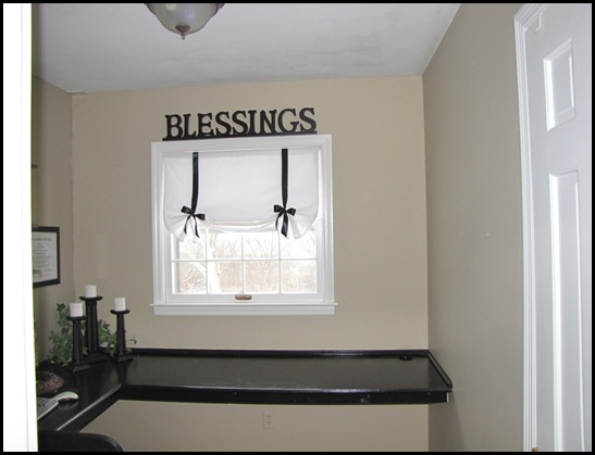
I decided to make another shade. Here it is…
My husband got me the “blessings” sign for Christmas. It is a very sentimental word for me because it is the word my mom said over and over when she was sick. She always taught us to count our blessings no matter what our circumstances.
The sign was very big as you can see, and I was having a hard time finding a place for it in my house. But then I held it over my window, and I loved it. If may not be for everyone, but for me, I love seeing that reminder each time I walk into my office.
Here is how I made this curtain…it was sooo easy!
I measured the height and width of the inside of my window frame and then added 1 inch to each measurement. That allows for a 1/2 inch seam on each side as you sew.
I did not use a pattern for this window. I usually use them when making window treatments, but I figured I could do this without one.
I bought some cotton fabric from Hobby Lobby. I got it on sale for about $2.00 a yard. I picked up three yards which cost me a little over $6.00.
Since the material wasn’t very thick, I decided to line the shade with the same cotton material.
I laid the material on my bedroom floor two layers thick.


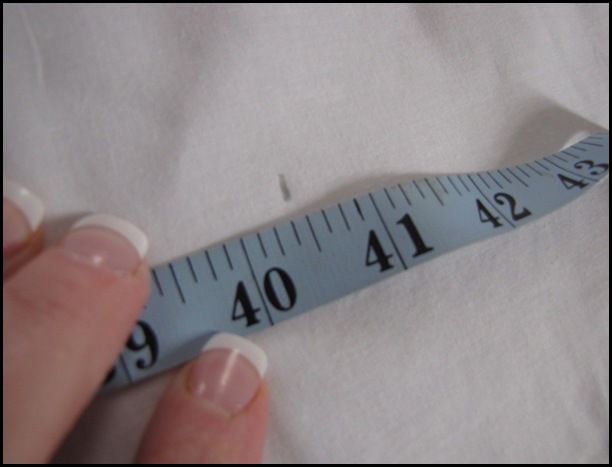
My window measured 39 1/2 inches wide, so I marked my material 40 1/2 inches.
Then I drew a line down my material by connecting all of my marks. (I used a yard stick to draw the line.)
Then I cut my material down the line and pinned it together to keep it straight.
I did the same thing down the material to get the length of my shade.
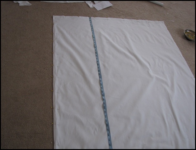
I marked it with my pencil and drew a line all the way across.
Then I cut the material and pinned it all the way around.
Next, I sewed a 1/2 inch seam all the way around the material, except for about 4 inches on the top.
I left the four inches open to pull the material through.
Trim your edges, but don’t cut your seam.
Press open your seams. This is an important step.
Then I turned my material inside out and pressed on the edges of the shade.
I turned down about 1 1/2 inches of material on top to make a rod pocket.
Then I sewed a straight stitch down the edge of the rod pocket.
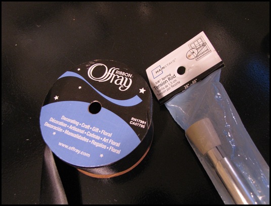
The only other materials I needed were some black ribbon and a tension rod.
I got them at Walmart. The tension rod was $5.00 and the ribbon was $1.99.
So the total cost of this shade was a little over $13.00…not bad!
I took a long piece of ribbon and slid it over the tension rod and down the back of the shade.
(Yes, there is paint on my window that I haven’t scrapped off yet. But who will see it…really?)
Mmmm….I guess all of YOU will see it…oops!
Then I folded the shade up accordion style and tied a bow.
I also used a hot glue gun to attach the ribbons to the front of the shade. It just helped them stay in place.
I’m really pleased with how it turned out.
It’s not perfect. But like The Nester says, “It doesn’t have to be perfect to be beautiful.”
Doesn’t the tan paint look so much better than the yellow?
My husband made me this amazing desk. I love it. If anyone is interested in how he did it, let me know. I might post about it sometime.
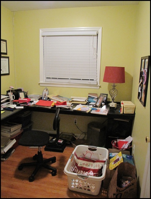
Here is the HORRIBLE “before” from a few weeks ago…
Oooh, this is so hard to look at!
Then it went to this…
And now I am here…
I’m getting there…
Now I need to accessorize, find a cute little rug, a new office chair, and maybe a chandelier? Wouldn’t that be cute?
I’ll be sharing the progress on my office throughout the week.
I haven’t joined any linky parties in a few weeks, so I am so excited to be joining (a little late)…
Met Monday at Between Naps on the Porch
DIY Day at A Soft Place to Land
Get Your Craft On at Today’s Creative Blog
Show and Tell and Blue Cricket Design
And More!
Blessings,
Traci








A tutorial on the desk would be great! We are doing a laundry room re-do and I would love to have a counter down one side - this looks like it would work wonderfully!
ReplyDeleteI am absolutely saving this for future reference...thanks so much for sharing, this does look lovely!
ReplyDeleteI think it's pretty darn close to perfect!! Love the shade, Traci, you're one talented lady. :)
ReplyDeleteDoes inspire that "aaaahhhhhh" feeling, like you've gotten it just right! I will look forward to showing how to do the desk!
ReplyDeleteSuzanne
Wow! Looks great! Thanks for the very detailed tutorial!
ReplyDeleteI love reading your blog and I would really appreciate the diy for the desk your husband made, it is wonderful!! Thanks
ReplyDeleteOh, it just pops now! Love it!
ReplyDeleteLove what you did! And love your blog!
ReplyDeleteBon @ Drab to Fab
gorgfabgoodies.blogspot.com
feel free to check us out too!
It looks so cute! I love the bows! I want to make me one!! Such great ideas! Thanks!
ReplyDeleteVery cute! I LOVE it!!!
ReplyDeleteI think it IS perfect my dear! You make me want to get back to tackling my curtains...why can't you be my neighbor? :)
ReplyDeleteCheers~
e
Wow - I LOVE the blessings sign and the contrast of the black with your colors. Are you familiar with the song "Count your blessings"? I love Dianna Krall's version of it. Your mom sounds like a blessing.
ReplyDeleteThe black and white really pop against the walls now. I love the blessings sign too...a creative place to put it.
ReplyDeleteThis turned out so pretty! And the "Blessings" sign is perfect there.
ReplyDeleteIf you want another party to link to, I'm hosting my very first one tomorrow:
A Little Craft therapy with Life in the Pitts
http://lanieree.blogspot.com/
So great! I love your white/black style!!!!! It looks so tender and sweet!!!!!!!!!
ReplyDeleteI loved the look of the old shade, but you were right once you painted in there it just didn't look right. I love your new window dressing and the blessings sign over the window.
ReplyDeleteIs it bad that I was not interested in how you made the curtain but was very impressed with how good your nails look:) Seriiously, that looks soooo much better. I can't wait to start painting my guest bathroom and upstairs with that same color. Love ya Sis!
ReplyDeleteIt looks great. I do like the second one best and I love the "blessing" over the window.
ReplyDeleteYou made some wonderful choices for that space. It looks the best by far in its current state. And I LOVE the Blessings sign over the window. I have one above one of my dining room windows that says "Home is where your story begins." One of my favorite sayings. Thanks for sharing!
ReplyDeleteYour office looks much better. I like the new paint color and window treatment. The black ribbon is lovely! The window blessing is perfect in that space! Well done! Lisa
ReplyDeleteOh my gosh! I LOVE that! It looked so easy too! I can totally do that! lol I'm GOING to do that! For my kitchen window :) Thank you!!
ReplyDeleteWonderful job, I really like it.
ReplyDeleteThe room looks wonderful!
ReplyDeleteOur new house (which is a rental) is seriously lacking in window treatments and I don't want to spend a ton of money because we are only going to be here a year until our house is finished...
I think this is the perfect solution!
Great job, Traci! I just love your "Blessings" sign--it's just right! And perfect for that space.
ReplyDeleteI like the khaki wall color, and black is great with it. I'd love to know how your husband made the desk. No doubt about it, your partner/carpenter is one of your blessings, isn't he? :)
Traci, I love it! The "Blessings" sign is absolutely perfect. What an awesome reminder?! Thanks for sharing! And... yes, I think you should post about how your husband made your desk. It's great!
ReplyDeleteWow, I love the Roman shade! Ok, this weekend I may just give it a try, I've been meaning to for a very long time. I'm so glad I found your blog!
ReplyDeleteTraci it looks beautiful and I do love it with the blessings sign above it. So pretty! Thank you for the step by step tutorial. You make it look easy to try this one. *Smiles*
ReplyDeleteIt looks really clean and fresh. Love the blessing sign above the window. Great idea!
ReplyDeleteOh I love it! Especially the sign on top, so precious!
ReplyDeleteLove the curtain! so pretty. you have such a beautiful home. :-)
ReplyDeleteI love it! I think it looks fabulous. I also think the Blessings sign is perfect in its location. It seems to help tie it all together.
ReplyDelete~ Tracy
Great job Traci. Love the black and white.
ReplyDeleteHugs,
Cindy
I think it looks fabulous!!! I love the colors and the sign is beautiful, what a good husband you must have to get you such a thoughtful gift!
ReplyDeleteI think it looks great! I love the curtain in black and white and the color you picked for the room it beautiful! You have a great husband to get you such a thoughtful gift and I think it looks perfect above the window.
ReplyDeleteThe shade turned out great! I love the desk and the blessings sign is perfect in there.
ReplyDeleteteri