Oops. I did it again!
I made another window treatment for my office.
If you are keeping count, which I am trying not to, that’s window treatment #3 in just a couple of months.
Yes. I am bordering on completely insane.
But I am very pleased with the results, and I am announcing here in front of everyone, “I will not make another window treatment for this office for at least a year. I promise.”
My office is the smallest room in my house, yet it has given me the biggest headache!
I just couldn’t get the look I was after, but I am as close as I am gonna get.
I. am. done.
Here’s where my office began…shortly after Christmas…
Yikes!
It took a couple of weeks to “decrapify” (as TDC says) my office.
Then I made this Roman Shade using my faux wood blinds, and I got this…
Double Yikes! Not liking it at all. Especially with my yellow walls that I hadn’t painted yet.
So I painted the walls my favorite color, Khaki Shade by Sherwin Williams and made another window treatment (#2).
Tutorial HERE.
Better, but I wasn’t liking the ribbons. Don’t know why. They just weren’t jivin’ with me. Too cutesy? Too girly?
I was trying to accessorize the rest of the office, but I could not get pass the window treatments. They were just plain buggin’ me.
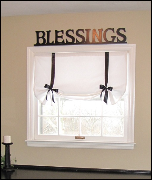
So I used a similar procedure and made one more window treatment with some black material from Hobby Lobby. (#3)
Phew! This is more what I was after!
I am still playing with the accessories. I need a lamp shade, but not sure what style to get. The lamp was my mom’s. It was a cream color and I spray painted it white.
I think I like the “blessings” sign over the window. Is it too much? Do you think it would look better without it? Be honest. I am a big girl….I can take it. :)
I have to use a flash when taking pictures of my office because without it, it looks like this…
Does anyone know if there is a setting on a camera that reduces the glare of a window without using the flash?
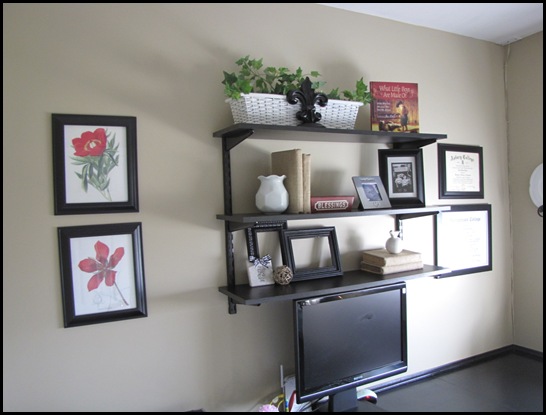
Anyway, I have finally finished accessorizing my shelves. I am not moving another thing! Did I say I am done with this room? Done.
All of my accessories are things I had around the house.
I have had the two flower prints for a few years. My mom printed them off the internet for me, and I put them in black frames. Instant artwork.
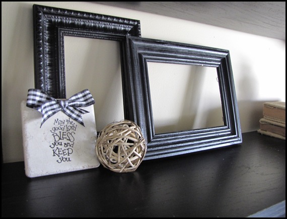
I couldn’t find anything to put on the first shelf. So I stuck these empty frames up there, and I kind of liked it.
Then I kept layering them with the little tile that I made a couple of months ago, and a little stick ball thingy that was Mom’s.
I LOVE my burlap covered books. I knew I was going to use them in my office. They were so easy to make. You can read about them HERE.
The little bird was my mom’s. Love it.
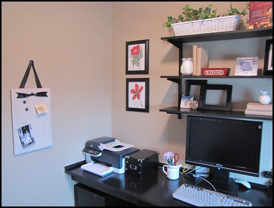
More of my burlap books, mom’s little white vase, and her red “blessings” tin…
I hung my burlap board on this wall. You can learn how to make one yourself by watching my first video tutorial. (Or buy one from my Etsy shop.)
I got the white basket from Goodwill last summer. It was $1.50 and an ugly green color. I spray painted it white. Easy.
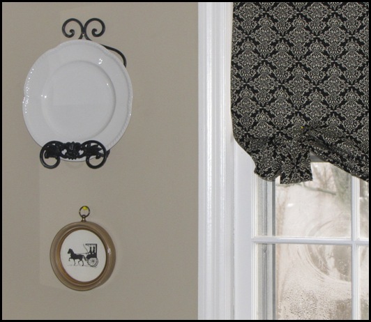
The plate holder on the wall was my mom’s. I put a white plate in it for now. I am going to get a smaller white plate with maybe a monogram?
I love the little horse and carriage silhouette I found at Goodwill for 50 cents. I just fell in love with it. I am contemplating painting the frame black, what do you think? (Yes, it’s hung with a push pin right now…see it?)
Two last things I want to do in here:
1) Cute little chandelier.
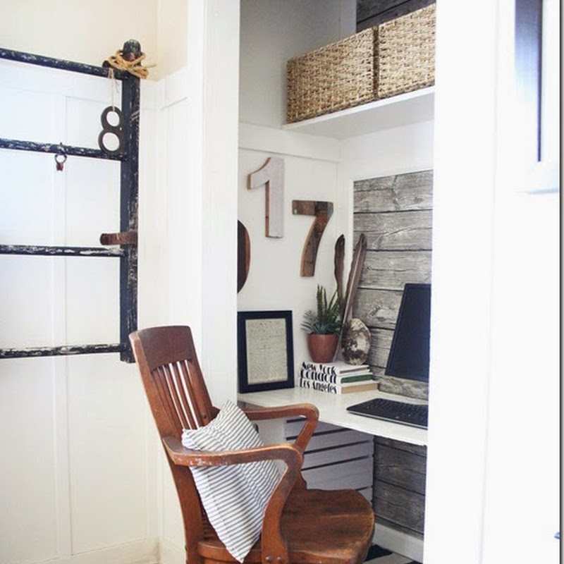
2) A chair I can re-do. I would love to find an old ugly dining room chair at Goodwill and turn it into this….
of course in white…
Well, that’s it. I’m D-O-N-E.
Is there a room in your house that has given you decorating nightmares too?
















So funny that you would say "nightmares," Traci, because I just wrote a post called "Dreaming of color."
ReplyDeleteI'd say your office has gone from a nightmare to a dream come true! It looks wonderful! I really like the new window treatment--you were right to switch to more color there. And your accessories are lovely. By the way, have you seen the monogrammed plates that Melissa at 320 Sycamore made for herself? She found monogrammed napkins, cut out the initials, and ModPodged them to plates. How simple would that be? I've also seen people stick a vinyl letter onto plates.
I love the way you've incorporated elements of your mom's into this room. Makes it even more of a special place. Great job!
Morning Traci!
ReplyDeleteLoving the new window treatment. It is more you. Bold and vibrant, but sophisticated. I like the blessings wording over the window. I say keep it if you like it. Now, for the lamp, wouldn't it be unexpected to put a black shade on it? Kind of like a drum shade.
I love the Blessings over the window. Don't move it. I think you should paint the gold frame black. You are so amazing. I love reading thses, I just never have time to do it...but goodness you are an inspiration and I just keep filing all these ideas away! Oh and by the way, I do like the new window treatment, but I loved the ribbons too. You need a little girlie in your life with 4 boys!
ReplyDeleteBeautiful. I've liked each treatment you've done, but this is my favorite. And I love the Blessings sign above. Having some of your mom's things around really makes the room.
ReplyDeleteMy nightmare room is my living room, 25x25 with no unbroken walls. Aarrgghh!
OOOOPS! I deleted some comments!
ReplyDeleteI am cutting and pasting them from my email:
Traci~~~
I love what you have done with your office. It looks like your own personal sanctuary! The latest window treatment is SO cute and really brings together all of the black pieces in the room. I also love all of your accessories on the shelves and walls. Fabulous job!
xoxo
Jane
**************************************
Traci, I LOVE the new fabric! I did the plate thing, too. I'd brush Eli's little hand in black paint and handprint a smaller plate. I did that in Lauren's room with pink paint and I cherish it. As for the small circle frame under the plate you could always paint it black and antique it to give it a different matching texture? With the lampshade you could do a red or you could do a large black and white print. It looks GREAT, friend~! Jenna
***************************************
You are too funny! I love the new look and still like Blessings being located above the window. My home office/pantry is now my problem room. My son and dil just moved in so I have had to move stuff into my office which has resulted in no wall space and now am just a wee bit cramped... I stand in the doorway and feel slightly overwhelmed by the resulting chaos. As for you horse and carriage silhouette, I like the idea of the frame being painted black. I think it will make it stand out more. I love the prints your mother gave you, they give the room a nice pop of color.
Looks good!
~Tracy
************************************
I like this treatment the best, by far Traci. (Though if you are trying to say you aren't girly... ;) ) The accessories are perfect: keep the Blessings sign, but paint that little frame black. I also really like your mom's Blessings tin, so cute. It looks fabulous!
Our problem room is our bedroom. We may try to tackle it over the next couple of years.-Lori
****************************************
Love the changes. I have rooms that I've decorated, and RE-decorated, and re-decorated again. :-) It's fun. It's always a work in progress.
I also like how you have things from your mom displayed. I have a few nice things from relatives who are no longer with us, displaying the items makes me think of them in a nice way: a quilt my grandmother made, some trinkets that belonged to my aunt; trinkets that belonged to hubby's grandmother. I'm sentimental like that.
-Handy Man, Crafty Woman
********************************************
Love the new window treatment and KEEP the "Blessings" sign ... it's perfect! I think the frame around the horse and carriage silhouette would look great painted black. Your office looks great!-Jaime @ Our Journey
Love the room! I think the black looks best for the window. I also agree with the others that you should paint the small round frame black....I did. lol..I have the same picture! I painted mine and I really like it. Everything else looks perfect.
ReplyDeleteI like the blessings sign over the window! Your room looks great! I love the black and white...it's so classic!
ReplyDeleteOur living room fireplace has been a nightmare. I obsess way too much over it but it drives me cra-zay!
Lisa
I love how your room looks with all the lovely accessories and your pretty window treatment. You really know how to bring a room together.
ReplyDeleteI've just started checking out your blog, thanks for all the inspiration. Just my two cents, I love the blessings above the windows and the black curtain. I think it would be nice to paint the frame black. I am on my way to check out the tutorial for the board and i love the look of the books. Very cool! Thanks for sharing.
ReplyDeleteKara
Okay, this is my favorite. Isn't it funny how we just know when something isn't right and then we know when it clicks?
ReplyDeleteOkay these treatments are the best by far! I'm loving the burlap covered books! How have I never thought of this???
ReplyDeleteGorgeous! Love that you kept at it till you loved it! Love the black, white, burlap... all my favs! ENJOY!
ReplyDeleteI love black and white. So classic. I made up my own lamp http://bumblebeebags.blogspot.com/2009/06/omg-look-what-i-did.htmlshades for my black and white room.
ReplyDeletesomething like that may look good in your office and can you say cheap and easy!
I really like your latest window treatment the best. I also like your blessing sign above the window. I think it looks really nice, especially with your new treatment. Good job!
ReplyDeleteYour office is looking wonderful. I love the new window treatment. It is perfect. Your accessories are great too. Yes, I have several rooms that give me fits, but then they just need a whole lot of new furniture and revamping which isn't going to happen for a while. Hugs, Marty
ReplyDeleteI like this version best! The office has come a long way is is looking wonderful. Great job.
ReplyDeleteCome decorate my office please! I love all of it. The red with the black and white is inspiring. Beautiful job! Blessings to you.
ReplyDeleteI like the fabric you used in this last one, Traci! I did like your roman shade though! Sometimes you just don't "feel" something and you have to keep at it until it feels right. I love that you shopped your house for all the accessorizing ~ good job!
ReplyDeleteLove the black and white and really love the blessing sign. So sweet how you have added your mom's touch there! I love how your pictures always seem to turn out bigger than mine! What can I do about making my pics on blogger bigger?
ReplyDeleteOne last thing, Girl, you must lay awake at night thinking of things to do. You amaze me.
With love and prayers, Cindy
My camera has a "backlight" option for when there is light behind your subject. Those window treatments are definately the ones!
ReplyDeleteOur master bedroom has always been a headache--it's the next room on my list and I'd be lying if I said I wasn't a little nervous. I've already had 2 false-start ideas.
ReplyDeleteAs far as your office goes:
-Love the new window treatment, but I liked the second one a lot as well.
-Leave the "Blessings" sign! The wondow would look very nekkid without it. Plus I like the fact that the "blessings" term is echoed in your mother's tin.
-Yes--paint the little silhouette frame black! That gold frame does nothing for it or the office.
I looks so great. A little more sophisticated now. I think a nice crisp round lamp shade would be great with some black ribon trim would look nice. I love your burlap wrapped books too!
ReplyDeleteI love love the black fabric you used! Your office looks magnificient. Love it! The sign "Blessings" looks wonderful up there as well. Love it!
ReplyDeleteSandra
Shoot Traci if you were closer I have two old parson's chairs in the attic that are screaming to be made over..
ReplyDeleteI think the office looks marvelous..great job.
Traci -
ReplyDeleteBeing a young mother and wife, sometimes I feel like my whole house is my "nightmare room"!! From hand-me-down furniture, goodwill furniture, and random new pieces of furniture that my husband and I have purchased, my house feels like uncoordinated hodgepodge mess.
However, with all that said, I have found hope in your blog!!! I came upon your blog from a friend's site, Stacey, whom I believe you are related to in some way. I was her maid-of-honor in her wedding, and I actually live in Nicholasville, KY.
Anyways, back to your blog, I absolutely love all of the projects you have posted here, and I can't wait to try some of the projects myself. When I do complete a project, I promise to email you some pictures! Thank you so much for your inspirations, and I can't wait to see what else you bring to us! God Bless!
Lindsey
Traci,
ReplyDeleteThis is sooo nice!! I love your simple, classic style. I'd say these curtains come in first place with the ribbon ones a close second. I did really like them too. You all have inspired me so much. I haven't sewed since home-ec. I'm getting ready to bring my mom's sewing machine here (which she doesn't use). I've also been searching my Goodwill with absolutely NO luck! I left today (another snow day!) with a Dr. Seuss video and a Veggietale video. Not exactly what I was hoping to find! LOL I did find a treasure at the Winchester Goodwill this past weekend though. This is starting to be a lot of fun. Thanks for your great ideas and for sharing them.
Your office looks great. I definitely need to work on mine since that is where all the junk is being stored while we redecorate the rest of the rooms upstairs. I will be glad when I can clean it up!
ReplyDeleteThird time's the charm! I love it! By the way, I was just in Marshalls today and I saw a slipper chair like the one you said you'd like to find on clearance for $35. The upholstery was awful, but it would look great with a slipcover! If you have a Marshalls close by, you might want to check in and see if they have any!
ReplyDeleteI really do love the 3rd shade!
ReplyDeleteMy *nightmare* room would have to be the hallway in the upstairs of my house. I have NO clue in what to do with it or how to decorate that area.
Can't wait to see the chandlier for the room. I am looking for one for my living room.
Thanks for sharing! :)
On my camera there si a setting for "backlight" which reduces glare without a flash.
ReplyDeleteBeautiful blog!
LOVE. The other two were pretty too, but that fabric is LOVELY. I also think the 'blessings' sign looks like it belongs there. Perfect!
ReplyDeleteWhat a great space for an office....sophisticated look, meaningful pieces, and subtle colors.
I love the 'blessings' sign.. keep it! :)
ReplyDeleteLike what you have done with the place!!!
ReplyDeleteYessssssss, I have decorating challenges and have been in prayer about what direction to go and am having a heck of a time deciding on colors...keep changing the colors. This isn't earth shattering, but I know I will relax and feel a whole lot better when I finally make up my mind.
Freezing in Kansas,
d
Very pretty office!
ReplyDeleteOh my goodness!! Everything looks SO pretty in your office!!! And I have loved ALL of your window treatments and I'm not sure I could pick a favorite!!! I'm definitely going to do one of them for our back door.
ReplyDeleteI am sure you've been asked this a gazillion times, but what color are your walls?? LOOOVE the color!!
His,
Mrs. U
Yes! I love this one Traci. It's really beautiful and classic in style. *Smiles*
ReplyDeletevery cute... love the empty frames too.
ReplyDelete(try using a coffee filter over your flash, it helps defuse the light)
Wow! You got it! Best treatment so far! It's a keeper!
ReplyDeleteI love it. Thanks for sharing it with us!
Looks fantastic! The lamp might be one way to bring some more red into the room. Leave the base ivory and then use a fun red fabric for the shade? The blessings tin is so great; it might be cool to tie more red back in?
ReplyDeleteI'm struggling with our Master Bedroom. We've got brown overdose at the moment and I need some fun accent colors! Thanks for the inspiration!
Looks wonderful! :-) Love the final/3rd version of the window treatment and think the "Blessings" looks perfect just the way it is. Like others have said, I'm struggling with my master bedroom as well, especially the whole balance of girly enough for me and not too girly for the hubby. The walls are white after almost 8 years of living in the house and I'm ready to change that! lol.
ReplyDeleteI love the black fabric! I think it has the most rich look of them all. I have to say that my whole house is giving me decorating nightmares.
ReplyDeleteyes, I would paint the frame black.
ReplyDeleteTraci, I LOVE it!!! And I personally like this window treatment best! AND... I think you should paint the round frame. I will keep my fingers crossed for you to find that perfect chair!
ReplyDelete