
I fell in love with this house in the Summer 2009 publication of Better Homes and Garden “Decorating” magazine.


I noticed how the white trim really stood out against the paint color of the walls.

I have always loved the contrast of black and white.

Look at this beautiful monogram…

There are so many different patterns in this house, but they go together perfectly.

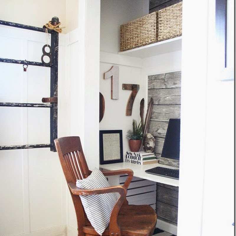
I LOVE this home office with the adorable touches of pink. I need more pink in my house!

Look how beautiful the burlap curtains are in this bedroom…


And I’m loving this chair…I saw an old chair like this at Goodwill that I’m thinking I might could turn it into a real beauty!

Ahhhhh…..touches of pink again!

Wouldn’t you love to blog on this back porch? I’ve seen burlap tablecloths like this one in Ballard Designs magazine…but I know I could make one for a lot cheaper!

SO, I was trying to find a new paint color for my kitchen this summer because I was tired of my yellow walls.
I tried a color called “Oyster”, and I hated it. My walls literally “glowed” when the sun shone on them.
Then I painted my kitchen a color called “natural”. It looked better, but it still wasn’t what I wanted.
When I saw the above pictures in the magazine, I really liked the color of the walls in the living room. I thought if it looked good enough to be featured in a magazine, then it was definitely good enough for my little house. And I thought it couldn’t be worse than what I had.
So I painted my kitchen for the THIRD time. (Yes, I am crazy!)
AND I LOVE IT!
I painted my den, foyer, and upstairs hallway the same color.
The color you ask?
Khaki Shade by Sherwin Williams
When I posted about the cafe shelves in my kitchen, I had several people ask me what color I had painted my walls.
So there you have it.
When I bought the paint at Sherwin Williams, they told me it was one of their best sellers. Yeah, for me!

Here is a picture of my kitchen. I will be posting about more changes I made in the kitchen in future posts.
Have a blessed weekend!
Traci